I can haz charts!
[Update: Thanks to an excellent suggestion from Chris Sexton, the visualizations are initially image files, and you can click through to the interactive html versions. Browser overload no more!]
[Disclaimer: this page will probably take a while to load because there is a lot of JavaScript further down the page.]
I have so much explaining to do about how I got to this point, but …
I finally made something interesting and I want to share! So the story of how I got here will be told later, via flashbacks.
Who, What Now?
First, a little context. I am working with a series of periodicals which were published in the mid-19th to early-20th centuries and subsequently digitized and OCRed by the Seventh-day Adventist denomination. The periodicals are available to the public at http://documents.adventistarchives.org.1
I will walk through my process for selecting periodicals at a later point, but I am currently working with 30 different titles, from which I have 13,231 individual issues that have been split into 196,761 pages. This is not “BIG” big data … but it is big enough. I did some math and if I were to look at each page for one minute a page, it would take me 409 days at 8 hours a day to look at the whole corpus.
In order to investigate the development of Seventh-day Adventist health beliefs and practices in relationship to their understanding of salvation, I am applying clustering algorithms to the corpus to identify those documents that contain discourses connected to my topics of interest. But, in order to have confidence in the results of those algorithms, I need an automated way to know more about the quality of the data that I am working with, especially since
- I was not responsible for the creation of the data and
- I cannot manually examine the corpus and still complete my dissertation on time (or maintain my sanity).
There are different strategies when it comes to dealing with messy OCR and determining how much it can be ignored, some of which depends on the questions being asked and the types of algorithms in use. However, there has been little discussion about ways to ascertain the quality of the documents one is working with and the processes for improving it, particularly when you do not have a “ground truth” against which to compare. The approach I am pursuing is to take each token in the document and compare that token to a large wordlist of “verified” tokens.2 More on the creation of that wordlist to come. (Spoilers: I read the README for the NLTK words list … and wept.)
This approach is not in any means fool-proof. It is really bad at dealing with
- errors that happened to create new “verified” tokens,
- obscure words or figures referenced by the SDA authors (despite my best efforts to capture them),
- intentional mis-spellings (there are a few editors who … really could not spell),
- names of SDA community members,
to name a few. This is to say, there will undoubtedly be a number of correct OCR transcriptions that are labeled as errors and a number of incorrect OCR transcriptions that will not be labeled as errors. If I was attempting to compute absolute error rates and discarding error words, my approach would not be sufficient.
However, that is not the project at hand. My goal is to get a bird’s eye view of the quality of the OCR I am working with and evaluate the success of different strategies for correcting common OCR mistakes. I am also anticipating that different strategies will be needed for different titles, and possibly over different time periods, as the layout and print methods greatly influence the success of the OCR engines. By comparing the documents at different stages of cleaning to the same wordlist, I can report on the relative improvements, even if not all errors are captured.
All that to say … I did that and I have some pretty-pretty graphs from the first round of results! Here I am showing off two charts that I am using to get an overall picture of what is going on in the individual titles. I am also generating reports that focus in on potential problem areas (documents with high errors rates, docs with low token counts, the most frequent errors, very long errors (often linked to decorative elements in the periodical or to words that were smushed together during OCR), etc.).
Overall, the initial results are really promising! The only change I have made to the documents I am reporting on was to convert all of them to UTF-8 encoding (because Python. And Sanity.)3 The results indicate that the vast majority of documents have a “bad token” rate distributed around 10%. As a point of comparison, the Mapping Texts project considers a final “good token” rate of over 80% to be excellent for their corpus. Rather than overwhelm you with all of them, I want to highlight a few of the most interesting and point out the types of questions that they raise for me.
The results
Notes on the visualizations:
- Bokeh, the charting library I am using, insists on formatting the values under “0.1” in scientific notation, which you will see in the tooltips on the scatterplot graphs. I do not know why, and I tried to change it, but that led down a whole rabbit hole of error messages and incomplete documentation from which I have emerged only through struggle and determination with the values still appearing in scientific notation.
- I hid the x-axes on the scatterplots because they were illegible, but the x-axis is by document id, and sorted chronologically, with the earliest publication dates at the left of the chart.
- The visualization have handy interactive capabilities, thanks to Bokeh. They also make the memory load a bit large. So if your browser hasn’t crashed, you can zoom in to see the details on the charts a bit more clearly.
- I forced all of the distribution graphs to an x-axis of 0-1 in order to make it easier to visually compare between them. This resulted in some of the graphs being very tightly squashed, but you can zoom in to get a better picture of the different bins at play. Similarly for the scatterplot graphs, which are forced to 0-1 on the y-axis.
Our first victim: The Columbia Union Visitor, known hereafter as CUV.
Click through to the interactive visualization.
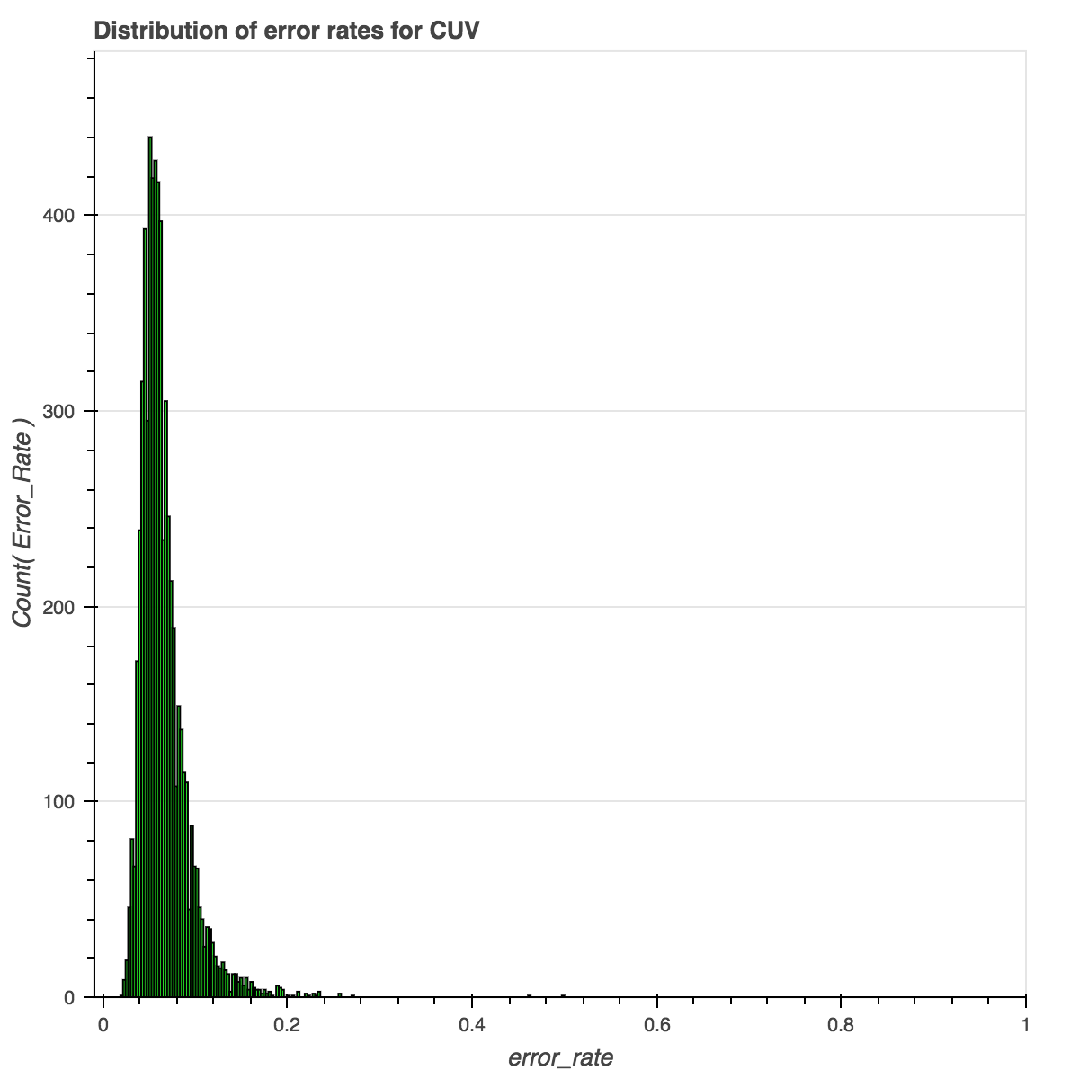
Overall, the distribution of error rates is beautiful. It is centered on .1, showing that the majority of the documents have an error (or “bad token”) rate of around 10%. But this graph does not give many clues about where the problem areas might lie.
When we look at the rates over time, we get a more nuanced picture. (Scroll down in the iframe to see the full graph.)
Click through to the interactive visualization.
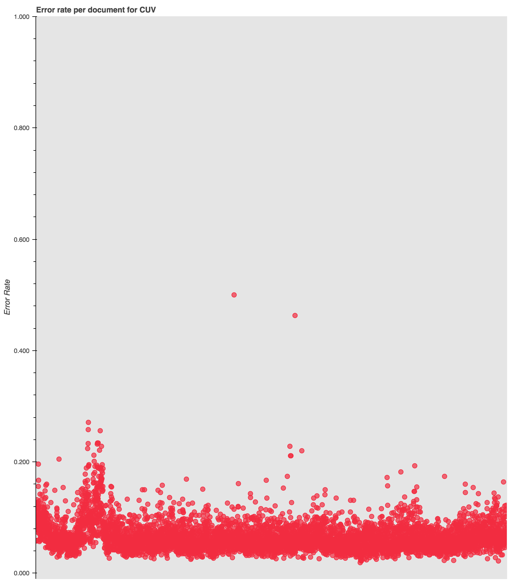
While most of the results are clustered down between 0 and .2, as expected, there is a curious spike in error rates around 1906.
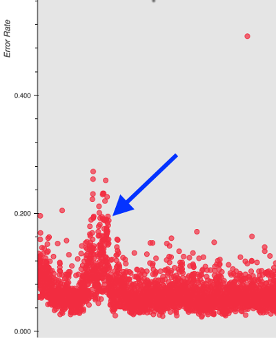
To explain this spike I can look at the types of errors reported for those years and examine the original PDF documents to see if there is a shift in formatting or document quality that might be at play.
Next: The Health Reformer, known hereafter as HR.
Click through to the interactive visualization.
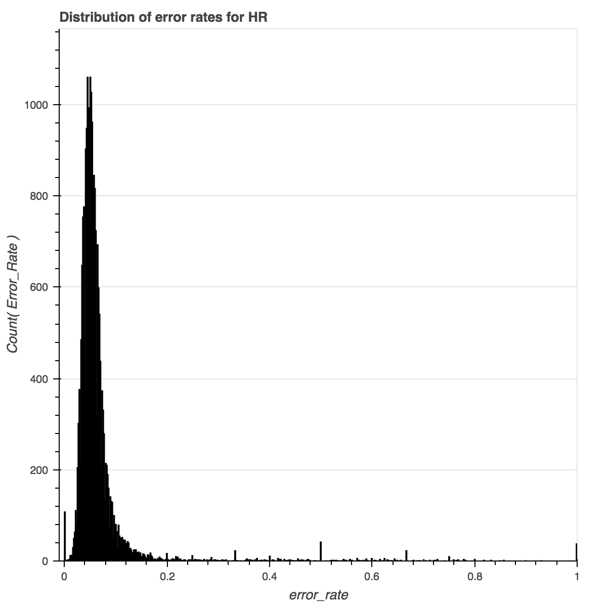
Here we have an interesting situation where the bundle of documents with an error rate of “0” is abnormally high. Either the OCR for this publication is off-the-charts good, or there is something else going on. Since there is also a spike at “1”, I’m guessing the latter.
Click through to the interactive visualization.
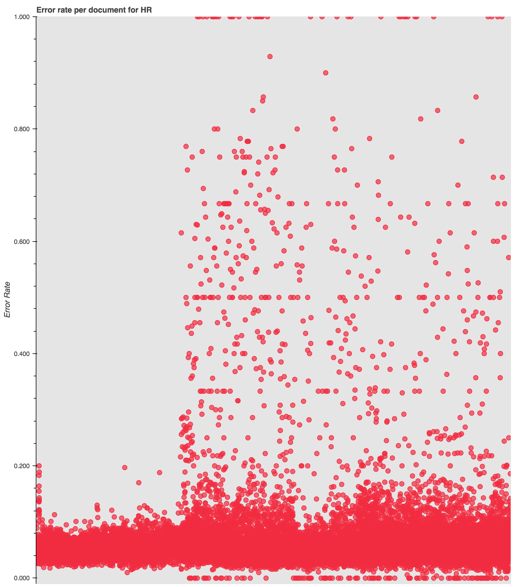
Looking at the data over time corroborates that guess and reveals another interesting pattern. The visualization shows a visible shift at around 1886 in the occurrence and density of high-error documents, which, interestingly, coincides with the rise of documents with “0” errors. Something is happening here!
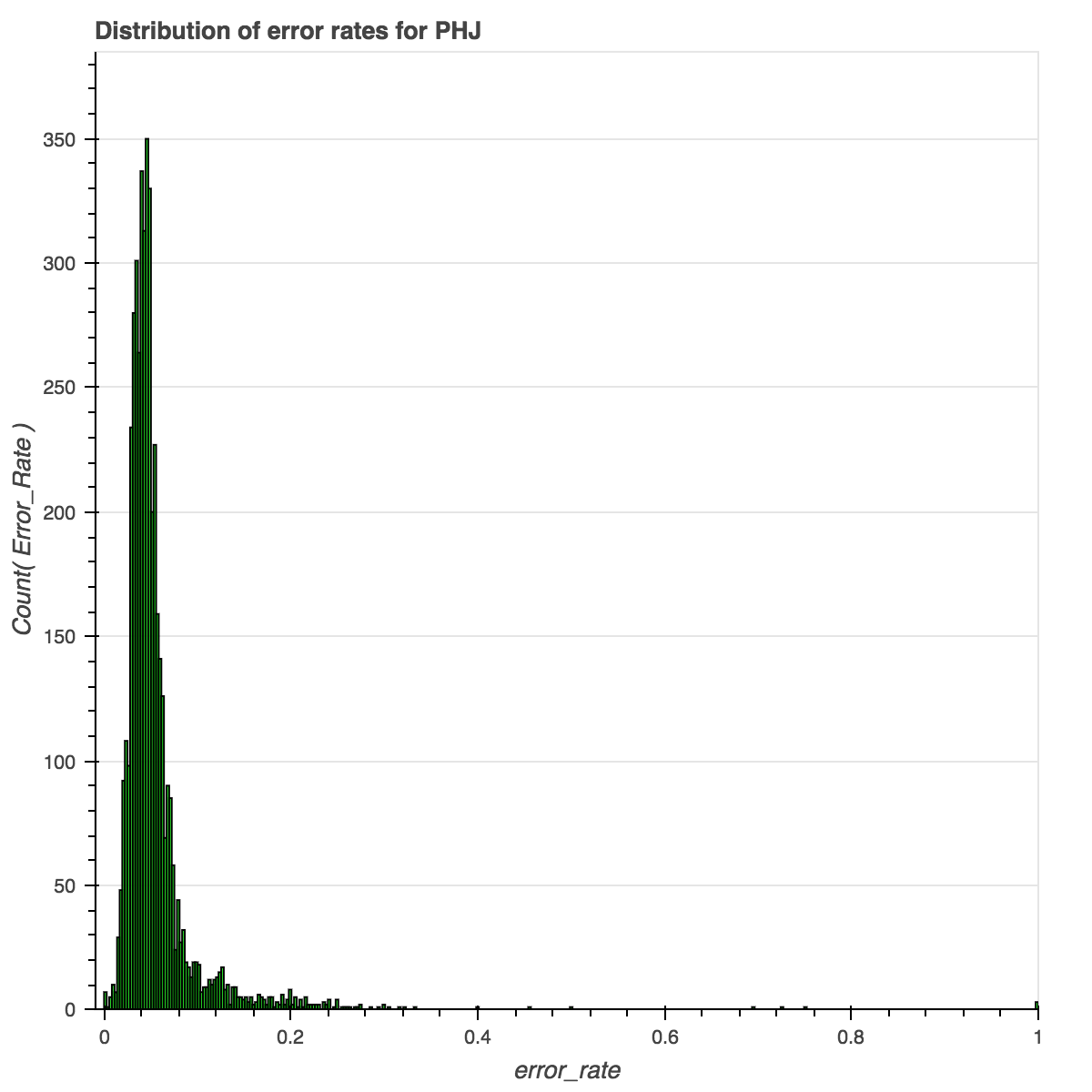
One last one (because otherwise your browser will never load). This pattern repeats, though at a smaller scale, in the Pacific Health Journal, or PHJ.
Click through to the interactive visualization.
Click through to the interactive visualization.
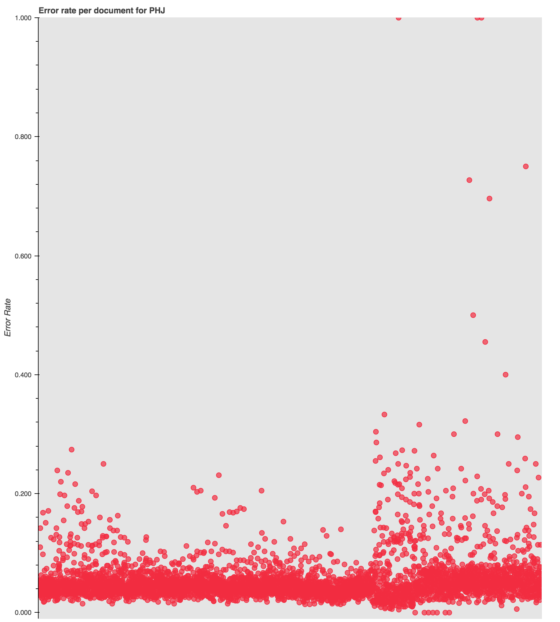
Notice the uptick in high-error documents at the 1901 mark, with intermittent spikes prior to that.
Not all of the titles have such drastic shifts in their “bad token” rates, and many have a consistent smattering of high error documents. But these are particularly illustrative of the types of information visible when examining the distribution of the data and the data over time.
All of this to say:
- the default OCR for these publications is pretty good. but …
- there are some interesting and potentially significant problem areas that would skew the data for particular time periods.
This data will serve as the baseline against which any computational corrections to the OCR will be compared. It will enable me to evaluate the effectiveness of the different corrections and to see when the changes have little affect on the overall error rates in the corpus.
And I will report back on what I find in the original scans and text files!
The code
I have uploaded the code I wrote to generate the corpus statistics as a gist at https://gist.github.com/jerielizabeth/97eeac0bf83365af7fd00bc6a0151554.
The code I wrote to create the visualizations is available as a gist at https://gist.github.com/jerielizabeth/c1ccd516681bf311630533be2bdb23d8.
Comments and suggestions are always welcome!
Acknowledgements
And thanks to Fred Gibbs for all the feedback as I have been working through how to evaluate and improve the OCR!
-
Funny story. As I was writing this, the SDA released a story about how they’re filling in some of the missing years of the digitized periodicals. So, what you see online is probably a bit different from the collection I am currently work from. ↩
-
As a point of reference, the Mapping Texts project worked with a corpus of approximately 230,000 pages. My approach to identifying errors is similar to the one pursued by the Mapping Texts team. ↩
-
The process by which is also to be documented at a future point. So much documentation. ↩
Enjoy Reading This Article?
Here are some more articles you might like to read next: